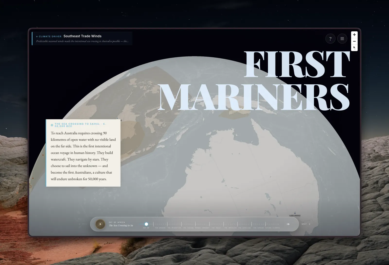
Climate Migration Map
Data Visualization · Interactive Map
An interactive historical climate migration map showing how climate shaped human civilization — from the Out of Africa migration to the Bronze Age Collapse and beyond.
Built for the Contra x Figma Config Makeathon, this project explores how climate has driven human migration throughout history. The map visualizes major climate-driven migrations using Open Historical Map data, with era-specific styling that shifts colors and borders to reflect each period.
Starting from the Out of Africa migration, through the Bronze Age Collapse and the Sea Peoples, the Great Famine, and into modern climate change — each era is styled distinctly so the map itself tells the story. The challenge was loading heavy tile data fast enough to feel responsive, while layering rich historical context on top.
The project pushed me into React and D3.js territory — tools I don't normally reach for — to handle the complexity of interactive mapping, tile loading, and dynamic overlays. Performance tuning the map tiles and reducing load-time black screens was a key battle.
Services
- Interactive Data Visualization
- React & D3.js Development
- Historical Map Styling
- UI/UX Design
- Performance Optimization
Selected Work